
But first we have to test 41 shades of ocean blue —
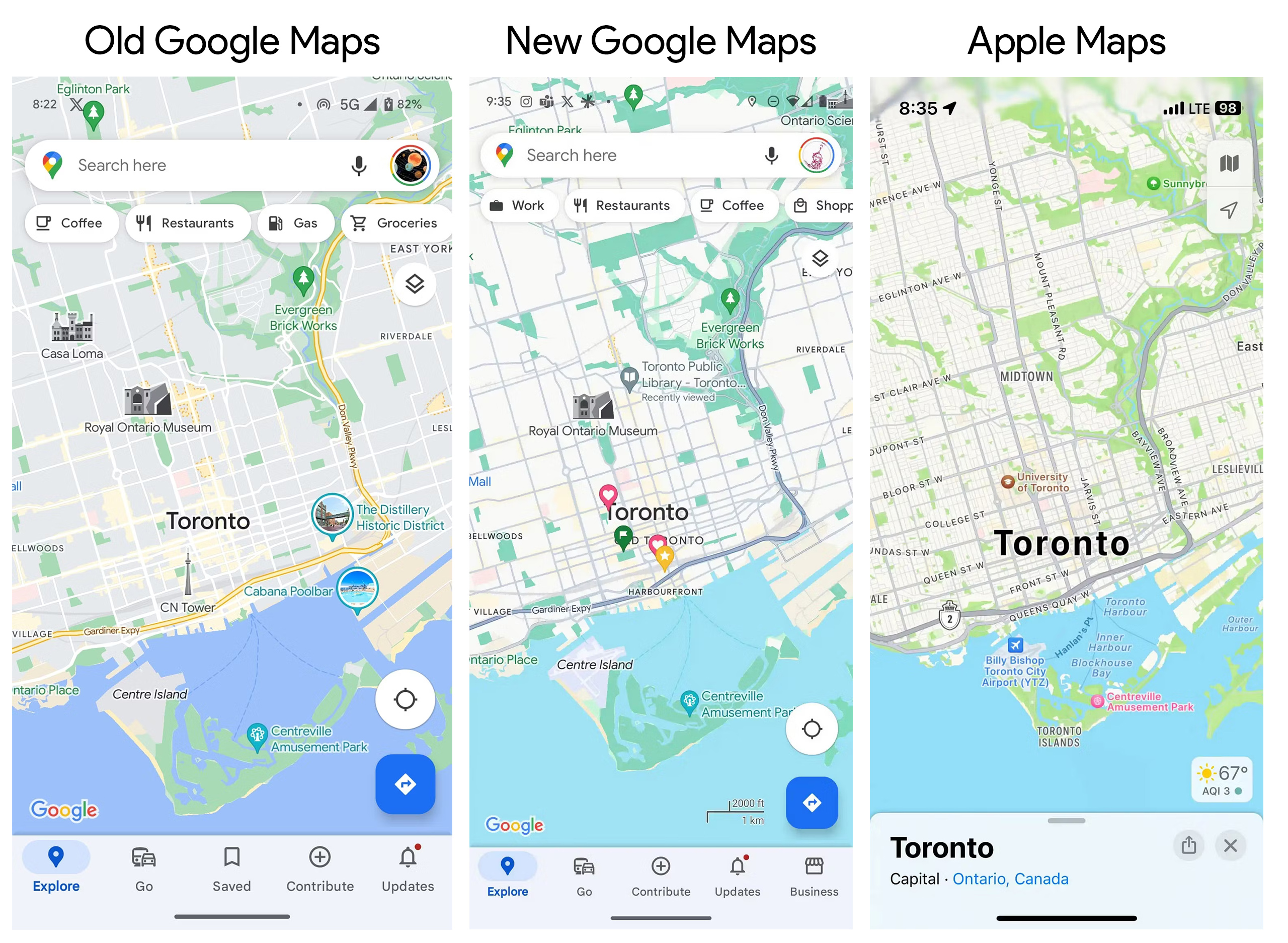
Dark gray roads and lighter backgrounds look a lot like Apple Maps.
Ron Amadeo
–
The familiar Google Maps interface might start looking a bit different soon. 9to5Google reports that Google is testing a major redesign of the default map layer with a new color scheme.
The new color scheme looks a lot more like Apple Maps. Today, Google Maps has a gray background for land and white roads, but this new version has a nearly white background for land and darker gray roads, just like Apple Maps. This one change makes a lot of sense: Gray is a lot closer to the actual color of a road, and the darker color lets roads stand out more on the map. Pretty much every color has been tweaked, though—the blue water is much lighter. The green forest is darker. Major highways, instead of being bright yellow, are now a darker gray than the normal roads.
9to5Google
Navigation mode picks up the new color scheme, too, with a darker green for the header and a dark blue for your current route. Previously, navigation was sort of themed around the Google logo colors, with Google Green for the header, red for a location pin, and blue, yellow, or red for the route, depending on traffic. The new design is a lot more muted.
The new look hasn’t been widely rolled out yet, and we’re not even sure if this is a one-off test or a glimpse at the future of Google Maps. Maps’ last big color overhaul was in 2020, and before that, the last big redesign was in 2017, so from a Big Tech Designer perspective of always needing to redesign everything every few years, it’s probably time.
Ron is the Reviews Editor at Ars Technica, where he specializes in Android OS and Google products. He is always on the hunt for a new gadget and loves to rip things apart to see how they work. He loves to tinker and always seems to be working on a new project.